Friday, May 13, 2011

Penguin Paperbacks

I love the Penguin paperback. Created by publisher Allan Lane of The Bodley Head after a trip to see Agatha Christie and the discovery of an utter lack of cheap yet decent reading material at the railway station, the first paperbacks with the Penguin imprint appeared in the summer of 1935.


The simple graphics - three horizontal bands, color-coded to indicate the genre - were created in-house, and it wasn't until the 1950s that illustrations other than the Penguin logo were introduced. The orange cover shown here indicated general fiction. This is Penguin 641, published 1948.


Penguin Handbooks, of which the above is the 1948 revised reprint of a 1944 title, began during WWII as part of the effort during the war to get the British public to produce more food for self-consumption. 


Titles under the Pelican imprint were viewed as educational titles. The first, shown here, was a 2-part publication of Shaw's 1928 text, with additional chapters. The Pelican versions retains the dedication to his sister-in-law, "The intelligent woman to whose question this book is the best answer I can make". The imprint was discontinued in 1990.


The 1960 publication of "Lady Chatterley's Lover" shows the change to vertical bands, and the introduction of illustrations and photographs to the covers. Penguin was famously charged with obscenity for publishing this title, a case which Penguin won and which marked a turning point in the censorship laws in Great Britain.

Later covers would make further use of photographs, collage and illustration to indicate in a more specific way the content of the book in question. Above, for example, is the cover of the 1962 Penguin Modern Poets 10, "The Mersey sound: Adrian Henri, Roger McGough, Brian Patten", which uses images from Beatlemania on the cover.


Penguins published in New York differed in design, font and size from those published in the UK. The above title, Penguin 511 by Eric Ambler, is a 1945 edition of a 1942 title. Although retaining the penguin icon, the American covers used illustration from the beginning, and were shorter than their UK counterparts. American Penguins make up the bulk of the Fales Penguin paperback numbers, although not all are signed by the author, as this one is.


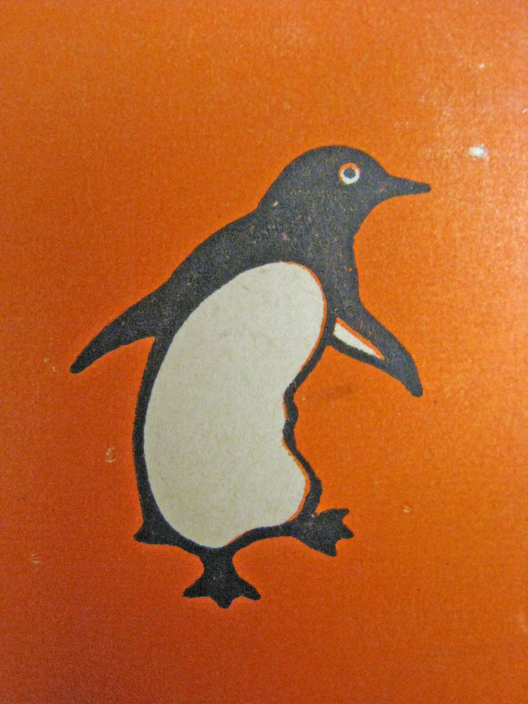
The Penguin icon, chosen for being 'dignified but flippant', according to the Penguin Group website, has changed over the years: sometimes it stands alone, sometimes there are dual penguins, but my favorite is the dancing penguin, shown above.

Friday, May 6, 2011

David Wojnarowicz biographer Cynthia Carr has been one of our most faithful researchers, poring over David's incredibly rich collection while working on her book (coming out Spring 2012!). Today, as she wraps up her research, she dropped by to look at David's Magic Box.


David's never-completed film-in-progress A Fire In My Belly has been much in the news over the last few months, and while parts of his Papers such as the journals are among our most heavily requested items at Fales, there are still many parts of his collection and work that remain relatively under-accessed and under-known. Carr says that the friends of David she interviewed were largely unaware of the box and its contents; but for those familiar with his visual alphabet, the toys, skulls, animals, stones, feathers, and religious icons form a certain kind of logic.

To see all of the objects in the Magic Box, just check out Series XIII Subseries B of the finding aid.